
Published 9 October 2026, Updated 9 October 2026
Charts combines charts about the selected members with two organization-wide trends. Resources is entirely organization-wide. Always check the scope of a chart before interpreting it.
Charts: the selected-member dashboard
Charts defaults to approximately the last month and does not allow a future end date. Choose a range in Show statistics between to reload the charts.
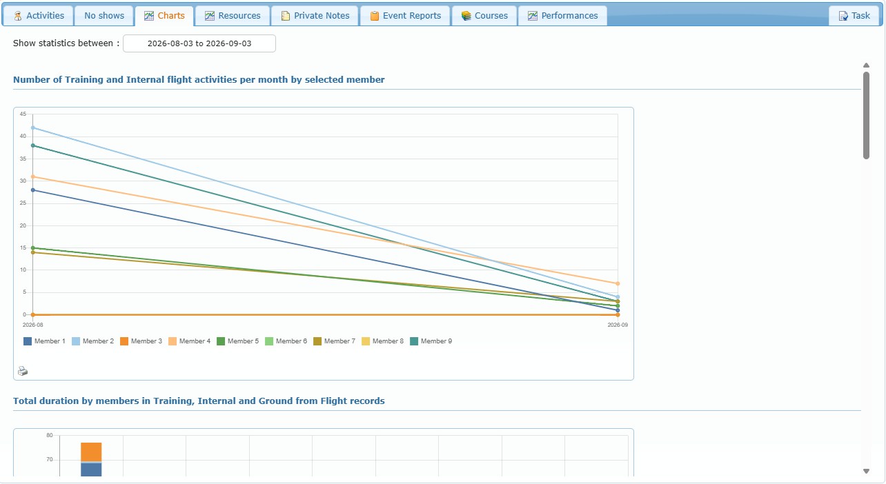
The six charts do not all use the same scope:
| Chart | Scope |
|---|---|
| 1 to 4 | Selected members and the selected date range |
| 5 and 6 | Whole organization; current year and the five previous years |
Chart 1: Number of Training/Internal flight activities per month
- Horizontal axis: month.
- Vertical axis: number of qualifying activities.
- Series: one line per selected member.
- Meaning: frequency of completed, positive-duration Training/Internal flight-record activity. A month with none appears as zero.
Use this chart to compare workload rhythm and identify sustained gaps or peaks. It does not measure teaching quality or explain why activity changed.
Chart 2: Training, Internal and Ground flight-record duration
- Categories: Training, Internal and Ground record types.
- Meaning: total recorded duration attributed to the selected members in those activity categories.
Use it to understand the mix of recorded activity. Do not add this automatically to the next ground-session chart: the two charts come from different operational record types and can describe different work.
Chart 3: Ground-session duration from course lessons
- Meaning: ground-training duration recorded through completed course lessons.
Use it to compare ground instruction entered in Training Records. A low value can mean less ground delivery or that the work was recorded through another activity type.
Chart 4: Training/Internal duration by resource category
- Meaning: total Training/Internal duration divided by resource category, such as aircraft or simulator categories configured by the organization.
Use it to see where instructional time is being delivered. Compare the category mix with qualifications, availability and assigned courses before interpreting it as expected or unusual.
Chart 5: Percentage of failed recommended lessons per year
- Scope: organization-wide, not limited by the highlighted members or the Charts date range.
- Period: current calendar year and the five preceding calendar years.
- Meaning: annual share of recommendation-linked lessons that failed.
Use this as a long-term organizational trend. A higher percentage deserves investigation, but it is not automatically negative: changes in lesson difficulty, evaluation policy, volume, or which courses use recommendations can change the result.
Chart 6: Total recommended lessons per year
- Scope: organization-wide, not limited by the highlighted members or the Charts date range.
- Period: current calendar year and the five preceding calendar years.
- Meaning: annual number of recommendation-linked lessons.
Read this beside Chart 5. A percentage based on a small number of recommendations can move sharply; the total chart provides the volume context needed to interpret the failure percentage responsibly.
Print a chart
Select the small printer icon on a chart, then choose the available scale, page format and orientation options. The printout reflects that chart, not the entire tab.
Resources: organization-level dashboard
Resources is independent of the selected-member list. It defaults from January 1 of the current year through today. Applying another range in Show statistics between recalculates the information.
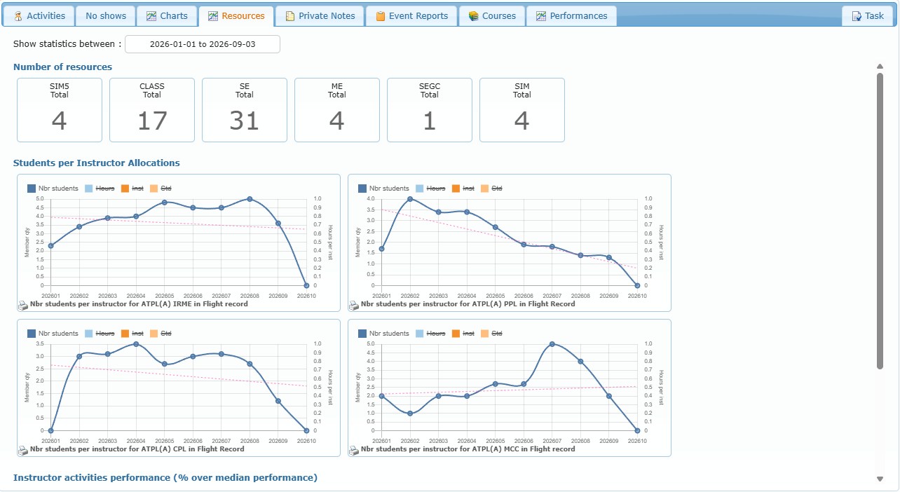
Number of resources
Each box shows how many distinct resources in a category were used during the chosen period. Hover a box for its type breakdown. Select a box to open the maintenance statistics page when that link is available.
This is an observed use count, not necessarily the complete owned fleet or every resource configured in the system.
Students per Instructor Allocations
Each configured line chart follows a selected training activity over time; its title is written under the chart. The reporting interval can be monthly, quarterly or yearly.
| Series | Meaning |
|---|---|
| Nbr students | Ratio of distinct participating students to distinct participating instructors for the period. Visible by default. |
| Hours | Total qualifying hours divided by the participating instructors. It uses the right-side Hours per inst axis. |
| Inst | Number of distinct participating instructors. |
| Std | Number of distinct participating students. |
Select a legend item to show or hide its series. The dotted trend line helps visualize the direction of the student-to-instructor ratio.
A rising ratio means more participating students per participating instructor in the configured activity. It can indicate higher instructor load, but it is not proof of overload: consider hours, course design, part-time availability, and the number of instructors and students shown by the hidden series.
Instructor activities performance (% over median performance)
These doughnut charts group instructors into activity-volume bands relative to the organization’s displayed benchmark. A value around 100% represents the benchmark; below 100% is lower recorded activity volume and above 100% is higher.
The bands are 0–9%, 10–49%, 50–74%, 75–99%, 100–149%, 150–199% and 200% or more. The slice value is the number of instructors in the band.
This measures relative activity volume, not competence, safety, teaching quality, availability or student results. Use it as a workload-distribution prompt and investigate context before acting.
The same Resources information, plus a current availability snapshot, is also available in the Resources Stats tab of Course responsible Center.