
Published 14 October 2026, Updated 14 October 2026
Part of the Activities Center guide.
Dashboard
The Dashboard is for checking trends and totals, not for approving entries. The Actual area summarizes the current situation. The Detailed view lets you choose a date range and one or more activity codes. Changing either choice reloads the charts. Chart legends can be used to focus on particular series, and available chart controls can prepare a printable chart view.
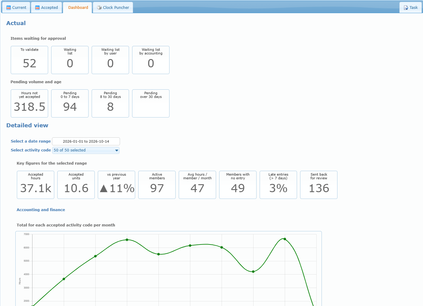
Use the Dashboard as a reasonableness check after acceptance—for example, to notice an unexpected drop or increase—but use the Current/Accepted lists and their reports for the final payroll detail.
Dashboard charts explained
The charts below follow the date range and the activity codes you choose in the Detailed view, and they reload when you change either one. Unless stated otherwise they count accepted entries only, so an entry appears in them once it has been accepted for a period. Click an item in a chart legend to hide or show it. The printer icon at the bottom left of a chart prepares a printable view.
Accounting and finance
Total for each accepted activity code per month
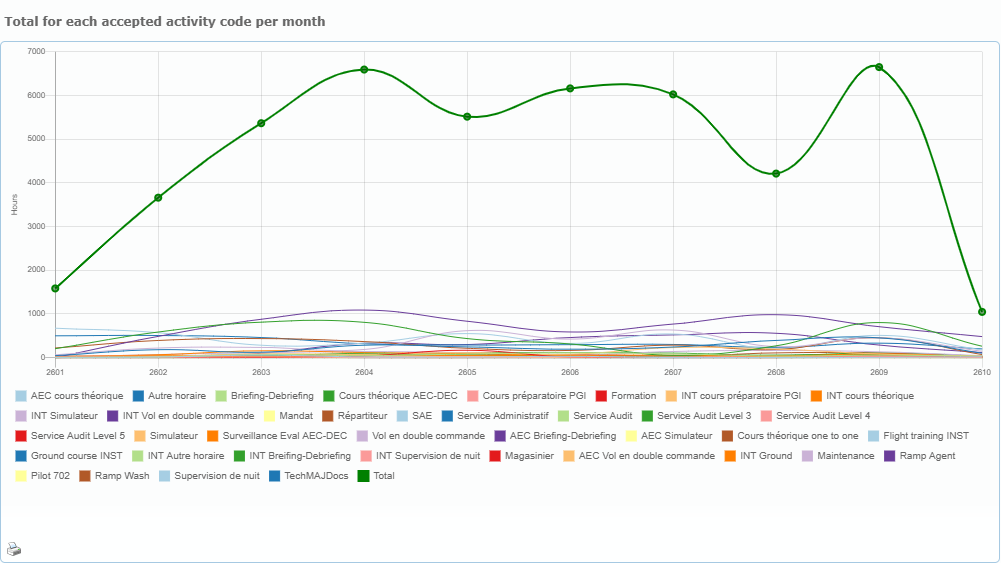
One line per activity code, plus a green Total line, with one point per month. Months are shown as year and month, so 2601 is January 2026. Use it to see which activities grow or shrink and which months are busy.
Total for each accepted activity
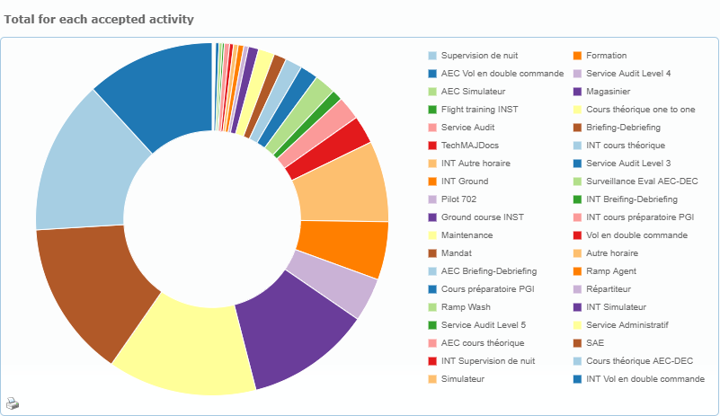
Each slice is the total accepted hours of one activity code over the whole date range. Use it to see which activities weigh the most.
Accepted hours per accounting period by activity group
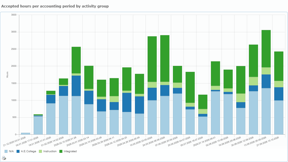
One bar per accounting period (the periods of the Periods manager), split by activity group. “N/A” collects the activity codes that have no group. Use it to compare pay periods and to spot a period that is unusually high or low.
Total for each activity group
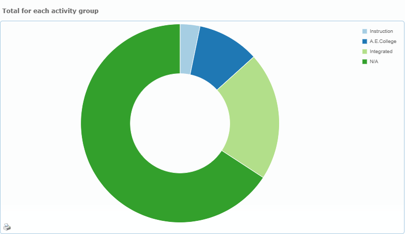
The same hours as the previous charts, added up by activity group instead of by code. Use it to see the share of each group.
Accepted hours per month compared to previous year
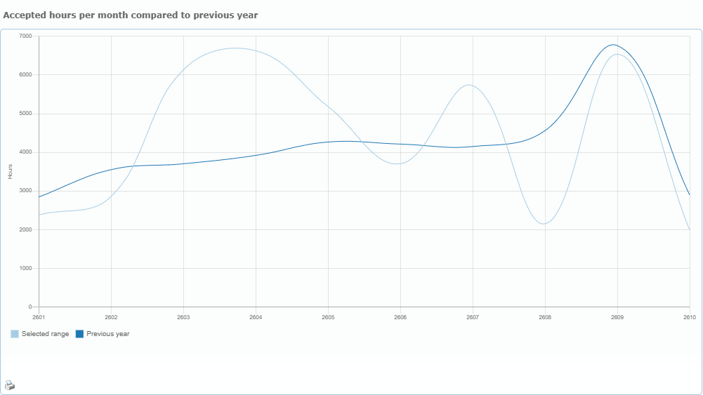
Two lines: the selected range and the same months one year earlier. The “vs previous year” figure in the key figures comes from the same comparison.
Accepted units for each unit based activity code
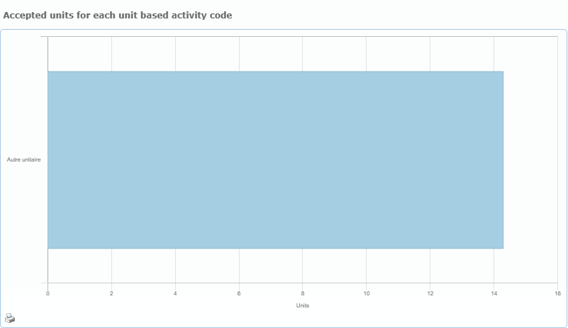
Some activity codes are counted in units instead of hours. They are shown here, not in the hour charts, and they are not included in the hour totals. This chart appears only when such codes have accepted entries.
Human resources
Hours accepted by member
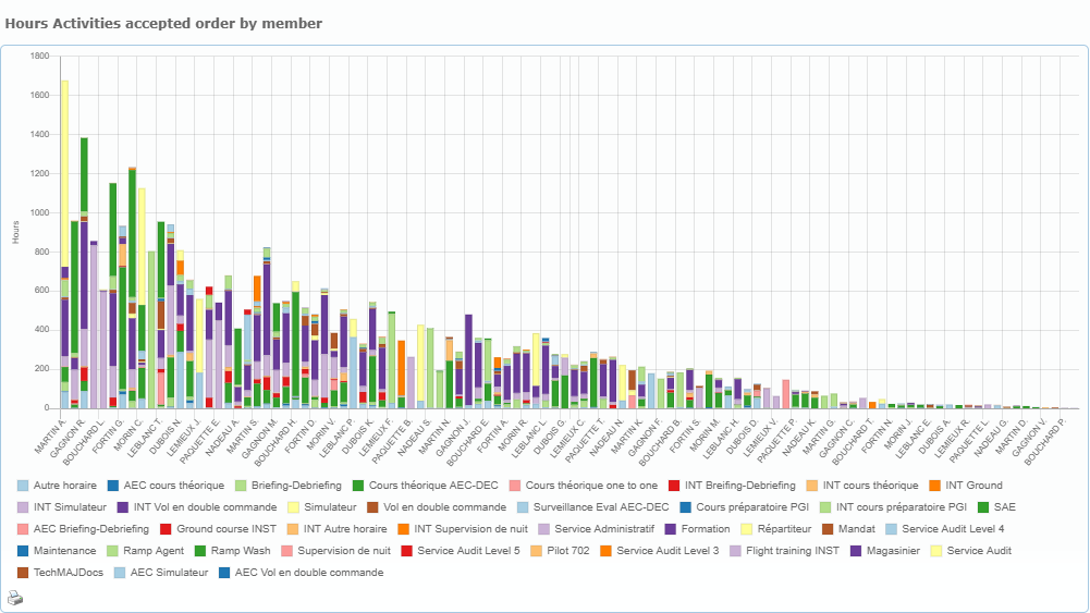
One bar per member, from the highest total to the lowest, split by activity code. Use it to see who accumulates the most hours and in which activities.
Top 10 members by accepted hours
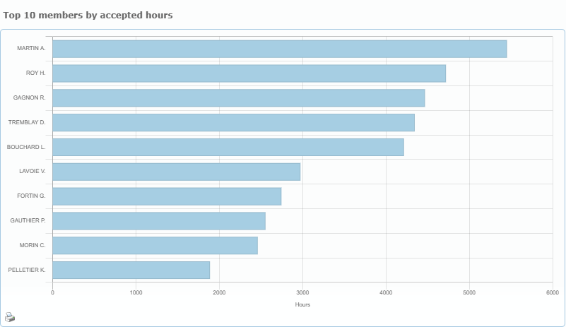
The ten members with the most accepted hours in the range, highest first.
Accepted hours per member and per week or month (top 30 members)
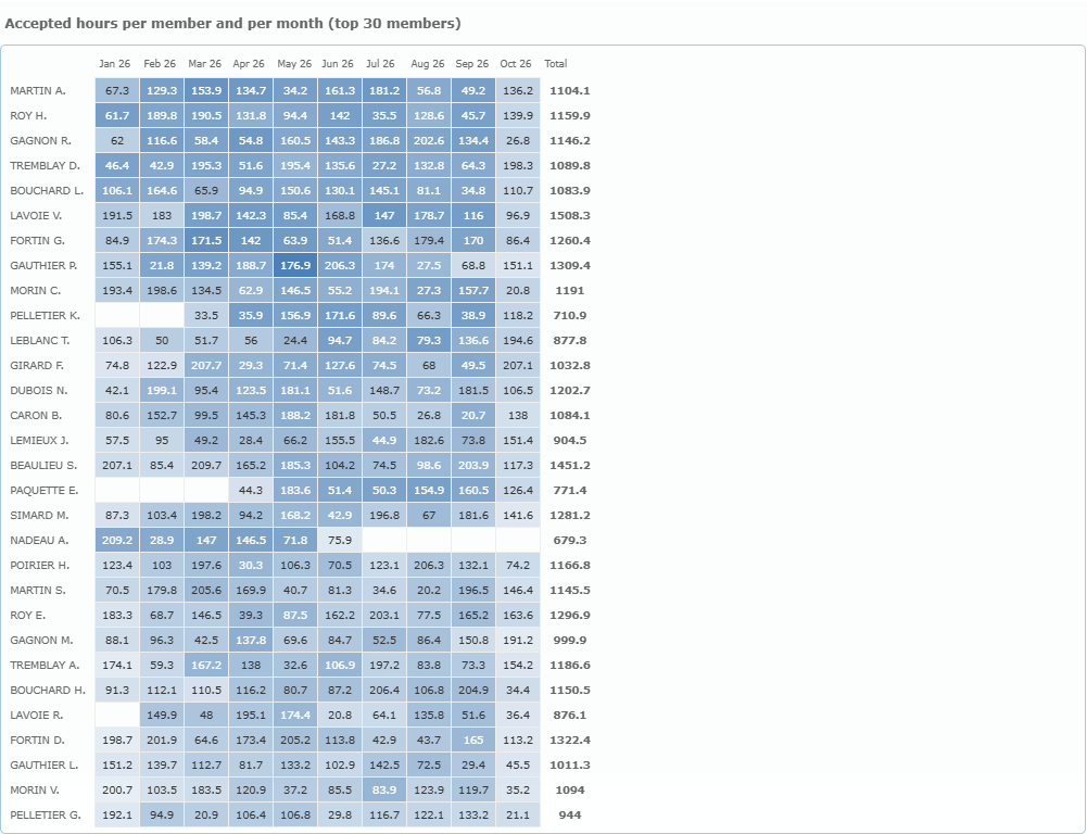
A grid with one row per member (the 30 with the most hours) and one column per week, or per month when the range is longer than 26 weeks. The darker the blue, the more hours. An empty cell means no accepted hours. The last column is the member’s total. Hover a cell to see the member and the period.
Entries sent back for review by member (top 15)
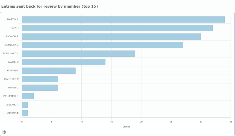
For each member, the number of entries in the range that accounting sent back to the waiting list at least once. Unlike the other charts, it counts entries whether or not they were later accepted. A high number points to entries that often need correction or an explanation.
Accepted hours per month: Clock Puncher vs manual entry
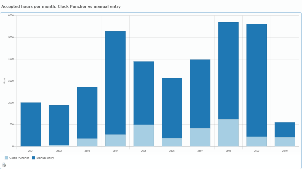
Shown only when Clock Puncher is available. Each monthly bar is split between hours that come from punches and all other accepted hours, which are labelled “Manual entry” in the chart. Here “manual” means every accepted hour that did not come from a punch, so it also includes hours taken from flight records and courses.