
Published 11 October 2026, Updated 11 October 2026
The heatmap shows, week by week, how many SMS events include each occurrence category. Choose the period in Select date range and click Filter!.
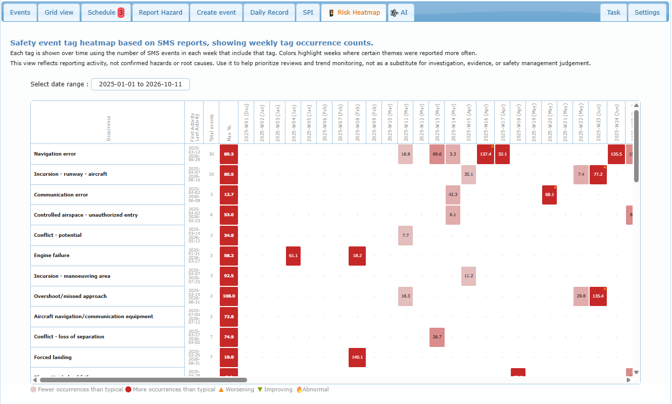
- Each row: the occurrence, its first and last activity dates, the total number of events and the highest weekly share.
- Light cells: fewer occurrences than typical; dark red cells: more occurrences than typical.
- Markers: Worsening, Improving, Abnormal (“this system was fine, now it suddenly isn’t”).
- Hover over a cell for the analysis of that week.
The heatmap reflects reporting activity, not confirmed hazards or root causes: use it to prioritize reviews, never as a substitute for investigation.
Link with the reports
The same trend is shown in each report: next to the Occurrence Category and Sub Category of the Security SMS section, a colored badge (for example Risk: Worsening) gives the heatmap state of that category for the week of the activity. Clicking the badge opens the Risk Heatmap tab.
Practical example: the row Incursion – runway – aircraft shows two dark cells in a row with a Worsening marker. Check the related reports, decide whether a safety bulletin or a briefing is needed, and follow the next weeks to see whether the marker changes to Improving.