
Published 28 February 2026, Updated 28 February 2026
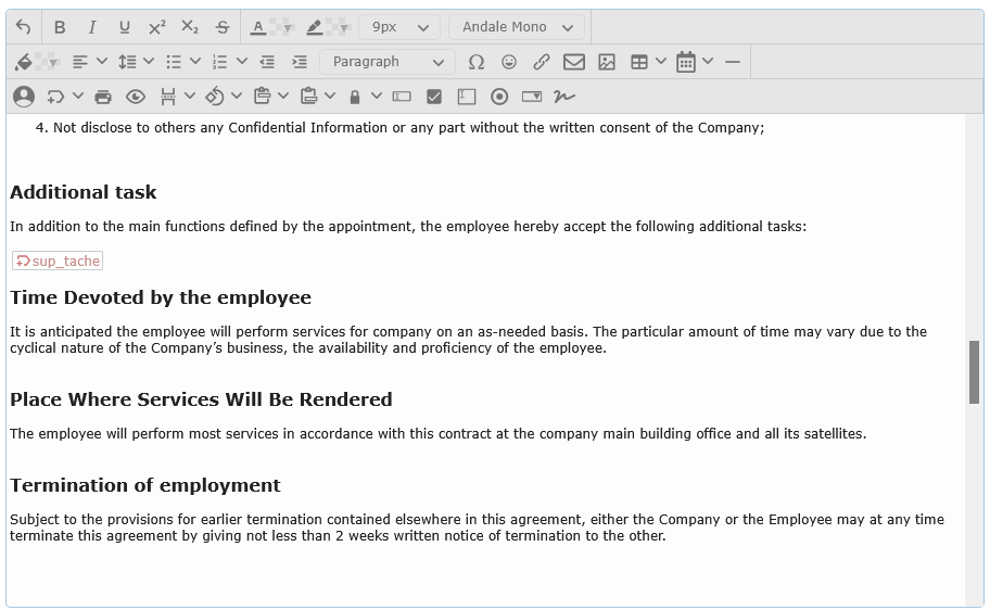
This guide explains every toolbar button that can be available in this module.
Important: each page can show a different subset of buttons. If a button described here is missing in your page, it has been hidden for that screen.
How to read this guide
The toolbar has 4 main use cases:
- Write and format text.
- Insert content (line, emoji, link, image, table, date).
- Insert dynamic placeholders (member/company/sender info).
- Prepare printable/PDF-ready content and fillable fields.
Each section below explains what the button does, when to use it, and what appears later in the final document.
Toolbar icon reference
Icon paths below are relative to this help file. If your publishing platform uses a different base path, adjust paths accordingly.
Main toolbar buttons
| Button | Icon | Icon file |
|---|---|---|
| Undo |  | undo.svg |
| Bold |  | bold.svg |
| Italic |  | italic.svg |
| Underline |  | underline.svg |
| Superscript |  | superscript.svg |
| Subscript |  | subscript.svg |
| Strike through |  | strike-through.svg |
| Fore color |  | text-color.svg |
| Background color |  | highlight-bg-color.svg |
| Font size | No dedicated icon | selector field |
| Font family | No dedicated icon | selector field |
| Align |  | align-left.svg |
| Line Height |  | line-height.svg |
| Bullet list |  | unordered-list.svg |
| Ordered list |  | ordered-list.svg |
| Outdent |  | outdent.svg |
| Indent |  | indent.svg |
| Block background color |  | cell-background-color.svg |
| Blocks | No dedicated icon | selector field |
 | print.svg | |
| PDF preview |  | preview.svg |
| Line |  | horizontal-rule.svg |
| Special characters |  | insert-character.svg |
| Emojis |  | emoji.svg |
| Link |  | link.svg |
| Mailto |  | envelope.svg |
| Image |  | image.svg |
| Table |  | table.svg |
| Insert Date |  | calendar-alt.svg |
| Member Avatar |  | user.svg |
| Portal Tags |  | tags.svg |
| Page break |  | page-break.svg |
| Page orientation |  | orientation.svg |
| Header |  | paste-row-before.svg |
| Footer |  | paste-row-after.svg |
| Lock to user |  | lock.svg |
| Input text |  | input.svg |
| Checkbox |  | selected.svg |
| Radio button |  | radio.svg |
| Textarea |  | textarea.svg |
| Dropdownbox |  | dropdown.svg |
| Add Member signature |  | signature.svg |
Table context-menu actions
| Action | Icon | Icon file |
|---|---|---|
| Delete table |  | table-delete-table.svg |
| Insert row before |  | table-insert-row-above.svg |
| Insert row after |  | table-insert-row-after.svg |
| Delete row |  | table-delete-row.svg |
| Insert column before |  | table-insert-column-before.svg |
| Insert column after |  | table-insert-column-after.svg |
| Delete column |  | table-delete-column.svg |
| Insert header row |  | table-top-header.svg |
| Alternate row highlight |  | table-row-properties.svg |
Text and paragraph formatting buttons
| Button | What it does | Typical use | What you see later |
|---|---|---|---|
| Undo | Restores the previous content state. | Fix accidental edits quickly. | Previous version of your text reappears. |
| Bold | Makes selected text bold. | Titles, key words, warnings. | Heavier text weight. |
| Italic | Makes selected text italic. | Emphasis, foreign words, notes. | Slanted text. |
| Underline | Underlines selected text. | Headings or highlighted terms. | Underlined text. |
| Superscript | Raises selected text above the baseline. | Exponents, references. | Small raised text. |
| Subscript | Lowers selected text below the baseline. | Chemical formulas, indexes. | Small lowered text. |
| Strike through | Draws a line through selected text. | Mark obsolete text without deleting it. | Text with strike line. |
| Fore color | Changes text color for selected text. | Emphasis by color. | Selected words change color. |
| Background color | Highlights selected text background. | Marker-like highlights. | Colored background behind selected text. |
| Font size | Changes selected text size. | Improve readability hierarchy. | Text appears larger/smaller. |
| Font family | Changes selected text font. | Match document style needs. | Selected text uses chosen font. |
| Align | Sets paragraph alignment: left, center, right, justify. | Layout and readability control. | Paragraph alignment changes. |
| Line Height | Sets line spacing of the selected block (1 to 2). | Dense text vs airy text layout. | More or less vertical spacing. |
| Bullet list | Converts current block to an unordered list. Styles: Default, Circle, Square. | Checklists and unordered points. | Bullet list block. |
| Ordered list | Converts current block to a numbered list. Styles include Default, Lower Alpha, Lower Greek, Lower Roman, Upper Alpha, Upper Roman. | Procedures and sequences. | Numbered list block. |
| Outdent | Reduces left margin (step-based). | Move text back toward left margin. | Paragraph shifts left. |
| Indent | Increases left margin (step-based). | Quotes, nested notes, visual hierarchy. | Paragraph shifts right. |
| Block background color | Applies background color to the whole selected block/paragraph. | Highlight full lines or sections. | Entire block gets colored background. |
| Blocks | Changes block type: Paragraph, Heading 1-6, Preformatted. | Headings and structured documents. | Block style changes immediately. |
Notes:
- Indent/Outdent work in fixed steps.
- Color pickers keep recently used colors and a quick palette.
Insert content buttons
| Button | What it does | Main options | What you see later |
|---|---|---|---|
| Line | Inserts a horizontal separator line. | None. | A horizontal rule appears. |
| Special characters | Opens a character picker with categories (All, Currency, Text, Quotations, Mathematical, Latin extended, Symbols, Arrows) and search. | Category + search. | Selected character is inserted at cursor position. |
| Emojis | Opens an emoji picker with categories (All, Symbols, People, Animals and nature, Food and drink, Activity, Travel and places, Objects, Flags) and search. | Category + search. | Selected emoji is inserted at cursor position. |
| Link | Inserts a clickable web link. | URL, Title, optional “Open in new window”. | Text becomes a clickable link. |
| Mailto | Inserts an email link. | Email address, Title. | Text becomes a clickable email link. |
| Image | Inserts an image from a source URL. | Source URL, Align (Default/Left/Right). | Image appears in content (resizable when selected). |
| Table | Opens a grid picker to insert a table size (up to 10 columns x 10 rows). | Choose table size by hover/click in grid. | Table is inserted and can be edited/resized. |
| Insert Date | Inserts current date in a chosen format. | Multiple ready-made formats. | Selected date format appears as text. |
| Member Avatar | Inserts a round avatar image for a selected member. | Member search, Align (Default/Left/Right). | Member photo appears in the document. |
| Add Member signature | Inserts a signature placeholder/image for a selected member. | Member search, Width. | Signature block appears at cursor position. |
Table editing actions (after inserting a table)
After a table is inserted, right-click inside the table to open table tools:
| Action | Result |
|---|---|
| Delete table | Removes the entire table. |
| Insert row before | Adds a row above current row. |
| Insert row after | Adds a row below current row. |
| Delete row | Removes current row. |
| Insert column before | Adds a column before current column. |
| Insert column after | Adds a column after current column. |
| Delete column | Removes current column. |
| Insert header row | Adds a table header row. |
| Remove header row | Removes existing header row. |
| Alternate row highlight | Applies alternating row highlight style. |
| Disable alternate row | Removes alternating row style. |
Tip: click an image or table to select it and resize it with drag handles.
Dynamic placeholder and document automation buttons
These buttons are used when your document should be auto-filled later (for example with contact/company/sender details).
Portal Tags
The Portal Tags button inserts placeholders that are replaced later with real data.
Main categories available:
- Contact
- System
- Sender
Examples of Contact fields:
- Given name, Last name, Additional given name, Gender
- Licence number, Date/place of birth, Citizenship, Visa expiry
- Address/postal address, Phone/Cell/Fax, Skype, Email, Group name
- Emergency reference fields (name, relationship, address, phones, email)
- Roles, responsibilities, tasks, enrolled courses
Examples of System fields:
- Company name, address, ICAO location code, website
- Administrator email
- Dynamic system date formats
Examples of Sender fields:
- Same profile family as Contact, but for the sender account
What you see later: placeholders are stored in the content and then resolved with real values at runtime/output.
Print/PDF control buttons
| Button | What it does | Key options | What you see later |
|---|---|---|---|
| Opens browser print for the current editor content. | None. | Print dialog opens. | |
| PDF preview | Opens a generated PDF preview in a new tab/window. | None. | PDF preview page opens. |
| Page break | Inserts a “new page” command. | Page size (US Letter, US Legal, US Tabloid, A4, A3) + Orientation (Portrait/Landscape). | PDF output starts a new page with selected setup. |
| Page orientation | Inserts orientation command for following content. | Portrait or Landscape. | PDF orientation switches at that point. |
| Header | Inserts header style command. | Available types: None, Company logo, Big company logo, Complete, Complete and date. | PDF header style changes from that point. |
| Footer | Inserts footer style command. | Available types: None, Page #, Page # and signature, Company address centered, Electronic Certified page. | PDF footer style changes from that point. |
| Lock to user | Inserts a visibility lock command. | User list is page-defined (for example Anonymous and/or named users). | Content can be limited to selected user context. |
Important:
- Print output excludes dynamic command markers.
- PDF preview uses command markers to build layout-aware output.
Fillable form field buttons
These buttons insert fields intended for fillable documents.
| Button | What it inserts | Options in dialog | Recommended use |
|---|---|---|---|
| Input text | Single-line text input field. | Default text, Width. | Short answers (name, code, value). |
| Checkbox | Checkbox with editable label text. | Default text, Checked on/off. | Yes/No confirmations. |
| Radio button | Radio button with editable label text. | Default text, Group id number. | Single choice inside a group. |
| Textarea | Multi-line input field. | Default text, Width, Height. | Longer comments/notes. |
| Dropdownbox | Select list field. | Width, item list entered line by line in value=title format. | Controlled choice lists. |
| Add Member signature | Signature field tied to selected member. | Member, Width. | Signature zones in formal documents. |
User flow examples
Example A: Build a simple policy letter
- Write title and body text.
- Use Blocks to set headings.
- Use Align, Line Height, and Font size for readability.
- Add Link and Image if needed.
- Insert Page break and set Header/
Footer. - Run PDF preview before final publication.
Example B: Build a fillable checklist
- Create section headings with Blocks.
- Insert Checkbox and Input text fields.
- Use Radio button groups for exclusive choices.
- Insert Textarea for remarks.
- Add Add Member signature at the end.
- Check final behavior in PDF preview.
Example C: Build a personalized communication template
- Write message text.
- Insert Portal Tags for Contact/System/Sender values.
- Optionally insert Member Avatar.
- Use
Printfor quick visual checks and PDF preview for final output behavior.
Validation rules and common blocking situations
- Member search fields (Avatar/Signature) require typing before selection; insert is meaningful only after selecting a valid member.
- Signature insertion requires a selected member; otherwise nothing is inserted.
- Width/size fields enforce minimum values (for example small numeric limits on inputs, textarea, dropdown, and signature width).
- Dropdownbox expects one item per line in value=title format. Incorrect lines can create empty or incomplete options.
- Link/image/mail fields can still be inserted with incomplete text; review content before publishing.
- Table insertion is limited by the visible grid selector (up to 10×10 in the current toolbar).
Quick best practices
- Draft text first, then apply styling.
- Use headings (Blocks) instead of only bold text for better structure.
- Use Portal Tags only where auto-filled data is truly needed.
- For printable forms, always run PDF preview before sharing.
- Keep one final Print check for spacing/alignment consistency.