
Published 12 October 2026, Updated 12 October 2026
This article describes every block available in the block library, what it is used for and which settings it asks for. Click Blocks in the HTML content toolbar to open the library.
Text blocks
| Block | Use it for | Settings / how to edit |
|---|---|---|
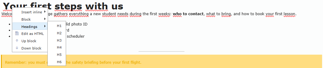
| Heading | Section titles | Inserted as “New Heading”. Right-click → Headings → H1 to H6 to change the level. Keep levels in order (check Outline) |
| Paragraph | Normal text | Click and type. Use Style text for formatting |
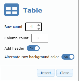
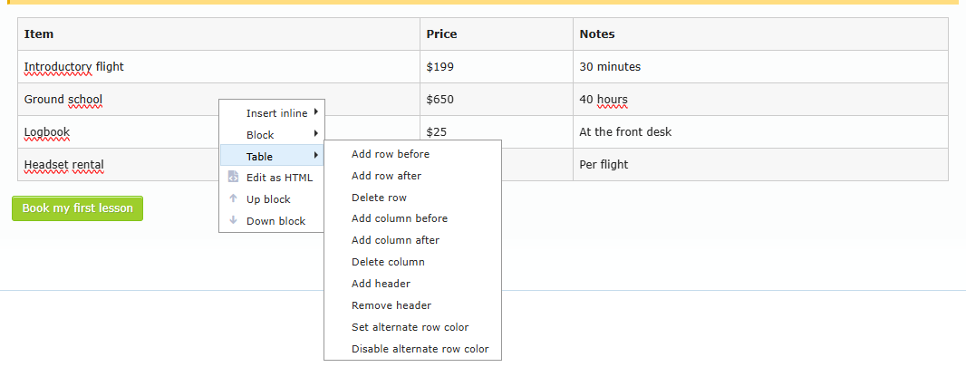
| Table | Tabular data (prices, schedules) | Dialog: Row count, Column count, Add header, Alternate row background color. Right-click → Table to add or delete rows/columns, add or remove the header, and turn alternate colours on or off |
| Quote | Highlighted quotations | Type the quoted text |
| List | Bulleted or numbered lists | Right-click → List → To ordered list 1.2.3. or To unordered list • |
| Code | Showing code or technical text as-is | Type or paste the text |
| Spacer | Vertical empty space | Resize the height in the editor |
| Separator | Horizontal line between sections | No settings |
| Details | Collapsible “click to expand” sections (FAQ) | Replace “Insert summary title here” and “Insert text here” |
| Excerpt | Show summaries of other pages, with links | Choose Pages, Width, and Border |
| TOC | Automatic table of contents built from the page headings | No settings; updates automatically |
Media blocks
| Block | Use it for | Settings / how to edit |
|---|---|---|
| Image | A single picture | Choose a file in the media library. Set Width/Height (px) and New window in the bottom bar |
| Image & text | Picture next to a text | Choose the picture, then type the text |
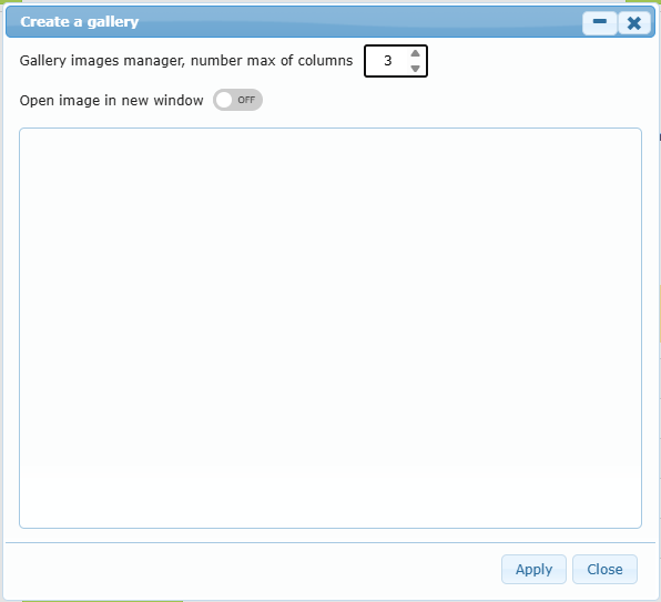
| Gallery | A grid of pictures | Create a gallery dialog: select images, set the max number of columns (1–10), and choose Open image in new window. Right-click → Gallery → Change column number / Modify gallery |
| Carousel | Rotating slideshow of a folder’s pictures | Folder, Type of carousel (Slider/Fader), Number max of picture, Recursive search in sub-folders, Width, Height, Border |
| File | Download link to a document | Choose the file in the media library |
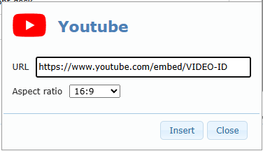
| Youtube | Embedded YouTube video | URL in the form https://www.youtube.com/embed/VIDEO-ID, Aspect ratio (1:1, 16:9, …) |
| Daily motion | Embedded Dailymotion video | URL https://www.dailymotion.com/embed/VIDEO-ID, Aspect ratio |
| Embedded Pinterest board | Board URL | |
| Embedded Facebook page | Facebook ID | |
| Embedded post | Paste the Twitter embed code | |
| Tiktok | Embedded TikTok video | Follow the dialog |
| Embeds | Any other embed code (maps, forms, players) | A text box opens: paste the embed code supplied by the external site, then right-click → Render HTML |
| Audio | Audio player | Audio file URL |
| Social media | Row of social network icons with links | Right-click the block → Social media → Add a social media brand, Square icons / Round icons. Right-click an icon → Set link or Remove. Drag icons to reorder |
Widget blocks
| Block | Use it for | Settings / how to edit |
|---|---|---|
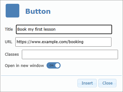
| Button | A clickable call-to-action button | Title, URL, Classes, Open in new window. Right-click → Buttons → Edit a button, Add a button, Remove button |
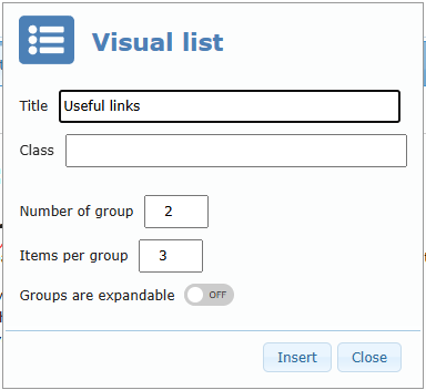
| Visual list | Link tiles or icon lists, optionally grouped | Title, Class, Number of group, Items per group, Groups are expandable. Right-click → Visual list → Link URL to item, add or delete rows, add or delete groups |
| Visual list+ | Like Visual list, with richer items that can expand | Same settings as Visual list |
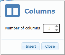
| Columns | Side-by-side layout | Number of columns (2–6). Right-click → Columns → add or delete columns |
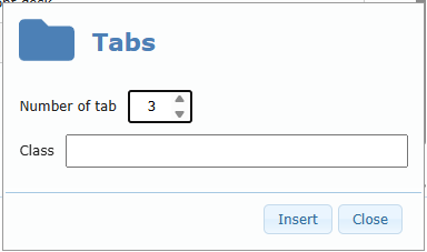
| Tabs | Content split into tabs | Number of tab (1–10), Class. Right-click → Tabs → Rename Active tab, Add a tab, Remove Active tab |
| Modified date | Shows the page’s last modified date | No settings. Tip: lock the date in Page Options to keep a specific date |
| Author | Shows the page author | No settings |
| Member | Contact card of a member | Title, Select member, Add emails (None / Primary email only / Primary and complimentary emails) |
| Member Avatar | A member’s photo | Select member, Rounded/Square style, border (No / Simple / Shadow / Theme), Quality (%) |
| Big title | Large underlined title | Type the title |
| Rss | News feed from another website | Feed URL (for example https://www.sample.com/rss.xml) |
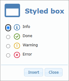
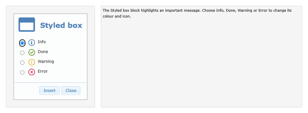
| Styled box | Coloured message box | Info, Done, Warning, or Error style |
| BarCode | Barcode or QR-type code | Code, Dot width, Line height, Dot or line color, Position |
Transport Canada blocks
| Block | Use it for | Settings |
|---|---|---|
| TC publications | Up-to-date list of Transport Canada publications | Select publications type, English/French |
| TC advisories | Transport Canada advisories | Select advisory type, English/French |
| TC acts | Transport Canada acts and regulations | Select Acts type, English/French |
These lists refresh automatically each time the page is displayed.
AirSupervision blocks
| Block | Use it for | Settings |
|---|---|---|
| E-courses | Show an e-course as a thumbnail or embed it | E-course, Display the thumbnail or Embed the e-course, Width, Height, Position |
| QA reco | Quality assurance recommendations summary | No settings; refreshed automatically |
| QA sched | Quality assurance schedule | No settings; refreshed automatically |
| SMS 12M. stats | Safety Management System statistics for the last 12 months | No settings |
| SMS range stats | SMS statistics over a date range | No settings |
| Stripe pay box | Online payment box (only when online payment is active) | Enter items code as quantity:code, separated by semicolons (qty:code1;qty:code2…, for example 1:WLANGEVAL), English/French |
Live blocks (QA, SMS, TC, RSS, E-courses, Excerpt, and so on) are refreshed with current information each time a member opens the page. You do not need to update the page manually.
What each block looks like on the page
The pictures below show how members see each block once the page is published: first on a computer (desktop page), then in the mobile app (mobile page). They were made with demo content in the preview, which is exactly what Desktop Preview and Mobile Preview show you.
Tip: the mobile version is narrower. Blocks placed side by side on a computer (Columns, Image & text) are stacked or squeezed on a phone. Always check Mobile Preview before publishing.
Heading
A large section title. Use H1 for the main sections and H2–H6 for sub-sections.


Paragraph
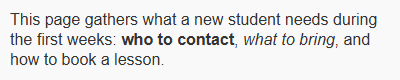
Normal text, with bold and italic words.

List
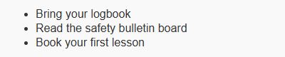
A bulleted list (or numbered list).

Quote
A highlighted quotation.


Code
Text shown exactly as typed, in a fixed-width font. Useful for frequencies, codes or technical values.


Separator
A thin horizontal line between two sections.


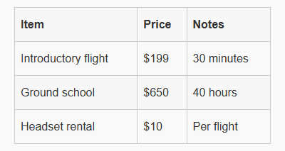
Table
A table with a header row and alternate row colours.

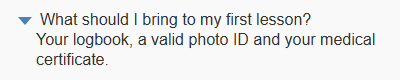
Details
A question or title that members click to show the hidden text, ideal for FAQs.

Big title
A large underlined title that separates the main parts of a page.


Image
A single picture. On a phone, the picture is reduced to fit the screen width.
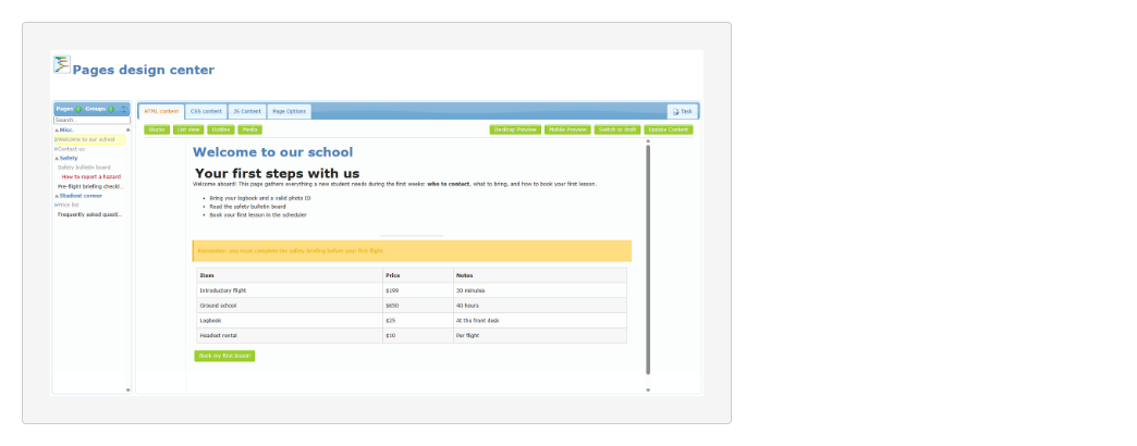
Image & text
A picture with a text beside it. On a phone, a wide picture leaves little room for the text: keep the picture narrow, or use separate Image and Paragraph blocks.
Gallery
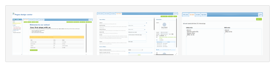
Several pictures in a grid. Members click a picture to enlarge it.
Social media
Icons linking to your social network pages (here, a single Facebook icon).


Button
A call-to-action button that opens a link.


Styled box
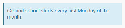
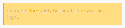
A coloured message box. The four styles are shown below: Info, Done, Warning and Error.






Columns
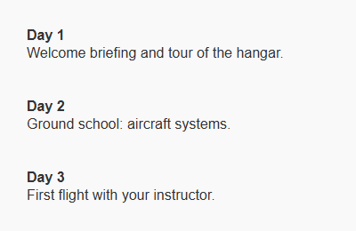
Content side by side on a computer. In the mobile app, the columns are stacked one below the other.

Tabs
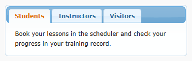
Content split into tabs. Members click a tab to see its content.

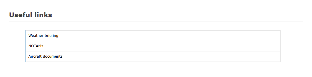
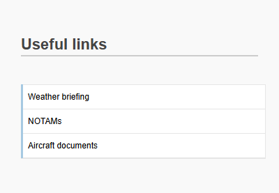
Visual list
A titled list of items, each item can be a link.
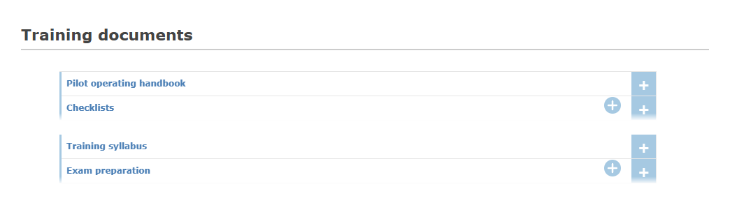
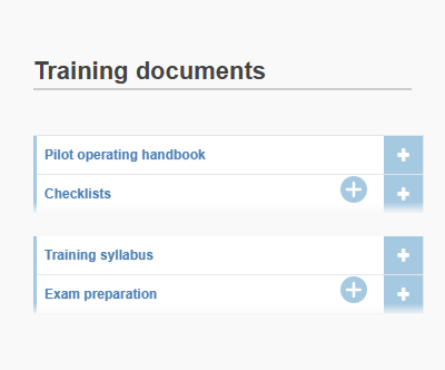
Visual list+
Like the Visual list, with items grouped and a + button to expand more details.
Modified date
The publication date and the last update date of the page.


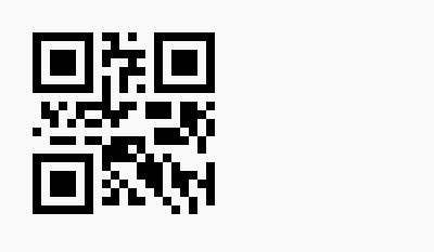
BarCode
A code that members can scan with a phone.

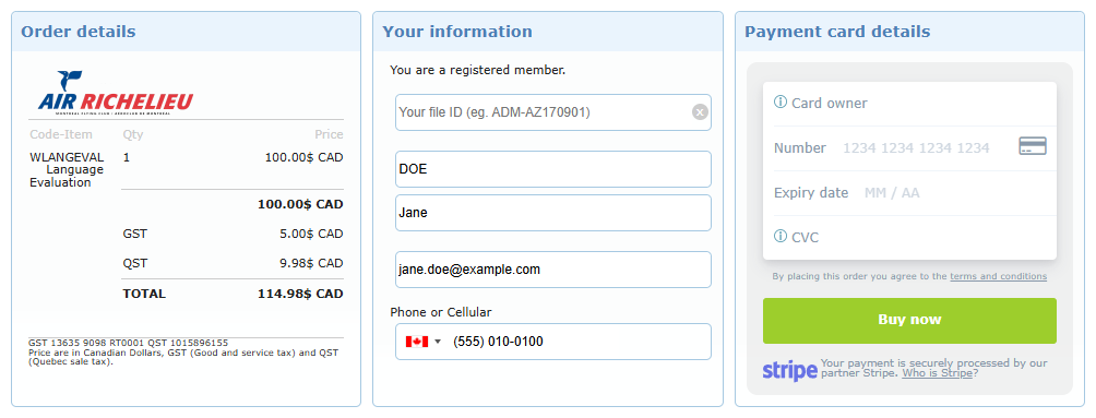
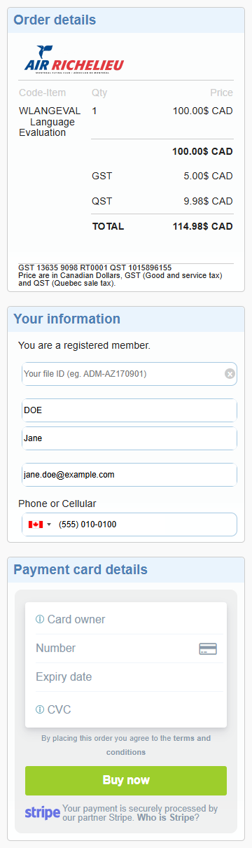
Stripe pay box
An online payment form. In this example, the item code entered is 1:WLANGEVAL (quantity 1 of the item WLANGEVAL). The box shows the order details with taxes, the member’s information (filled in automatically for a connected member) and the card payment area. The member details below are demo values.
Blocks that show live information (TC publications, TC advisories, TC acts, Rss, E-courses, QA reco, QA sched, SMS statistics, Excerpt, TOC, Member, Member Avatar, Author) display the current information of your organization when the page is opened, so they are not illustrated here. Embedded videos and posts (Youtube, Daily motion, Facebook, Twitter, Tiktok, Pinterest, Embeds, Audio) look the same as on the original website.