
Published 17 March 2026, Updated 17 March 2026
The Attendance Statistics view gives administrators a management summary of attendance activity over a selected date range. It is designed for trend review, instructor follow-up, no-show monitoring, and closure-quality checks.
This view is not the same as the live Attendance tree grid. The live grid is used to manage individual sessions. The statistics view is used to understand patterns across many sessions at once.
Inactive attendance records are excluded from these statistics. This means the charts focus on active attendance history rather than cancelled or invalidated sessions.
How to Open and Use Attendance Statistics
How to open:
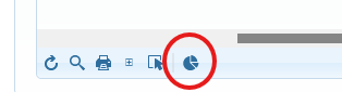
- Open the Attendance tab.
- In the Attendance toolbar, click the Statistics button.
- The Attendance Statistics window opens.
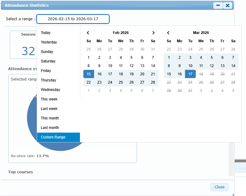
- Choose a date range at the top of the window.
- Review the summary cards first, then the charts below.
How the date range works:
- The statistics window opens with the last 30 days selected by default.
- When you change the date range, the charts refresh automatically.
- The date range works independently from the Attendance grid filters. It is a separate analytics window.
Recommended review sequence:
- Check the summary cards to understand volume and attendance rate.
- Review no-show charts to identify repeat patterns.
- Review opening-delay and close-time charts to identify timing or workflow issues.
- Review day, hour, and trend charts to see when pressure points happen.
- Use the course breakdown table for a final course-level summary.
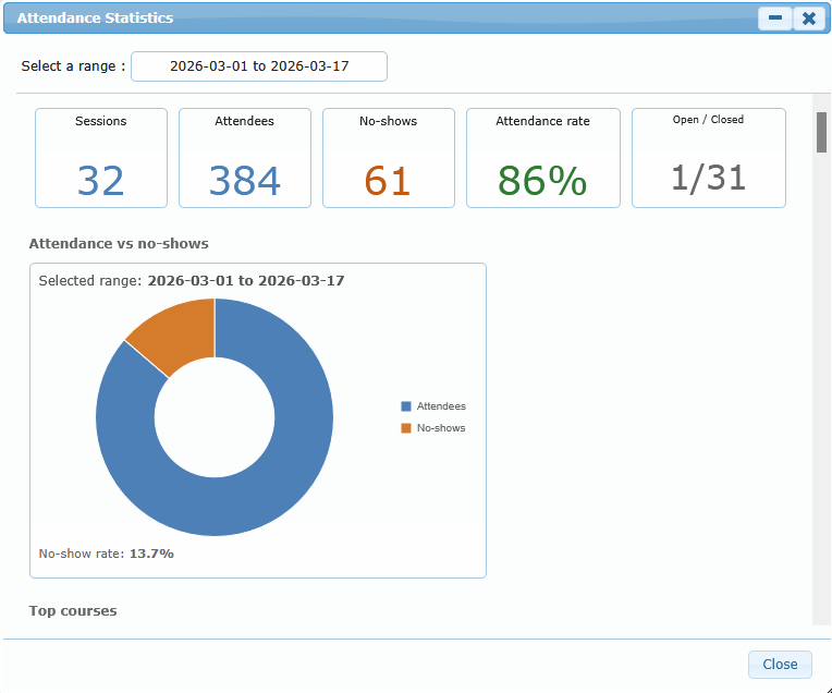
What the Summary Cards Mean
The top summary cards give a quick operational snapshot for the selected period.
| Summary card | What it means | How to use it |
|---|---|---|
| Sessions | Total attendance sessions in the selected range | Use it to understand total activity volume |
| Attendees | Total attendee rows counted as present | Compare with no-shows to judge participation quality |
| No-shows | Total expected attendees marked absent/no-show | Use for follow-up and reminder strategy review |
| Attendance rate | Percentage of attendance rows that ended as present rather than no-show | Use as a headline performance indicator |
| Open / Closed | Number of sessions still open versus sessions already closed | Use to spot closure backlog or same-day close discipline issues |
Practical reading tip:
- A high session count with many open sessions usually means the closure workflow is lagging.
- A healthy attendance rate can still hide weak performance in one course, lesson, or instructor, so use the charts below to find where the issue sits.
Chart Reference
The charts below do not all answer the same question. Some show volume, some show timing, and some show comparison between expected and real attendance.
Attendance vs no-shows
This chart compares present attendees and no-shows for the selected period.
Use it when:
- you want a fast overview of participation quality
- you need a first answer before drilling into course or instructor detail
Good for:
- weekly management review
- month-end participation summary
Top courses
This chart highlights the most active courses in the selected period.
What it tells you:
- which courses generated the most attendance activity
- where most operational attendance work is happening
How to use it:
- compare it with the no-show charts
- if one course dominates activity, review whether it also dominates delays or attendance issues
Attendance input type
This chart shows how attendance was recorded.
Typical meanings:
- QR style capture: attendees were added through identification scan
- Select/sign style capture: attendees were added manually through selection workflow
How to use it:
- monitor whether the organization is using the preferred capture method
- investigate sudden changes in capture habits if operational procedures were changed
Open to first attendee
This chart groups sessions by the delay between opening the attendance session and adding the first attendee.
What it helps you see:
- whether sessions usually start with immediate attendance capture
- whether many sessions stay open for a long time before the first attendee is entered
How to interpret it:
- more activity in the shortest buckets suggests prompt attendance capture
- more activity in the long-delay buckets suggests late attendance entry, delayed opening use, or inconsistent same-time recording
Scheduled end vs close time
This chart groups sessions by how early or late the attendance session was closed compared with the scheduled end time.
How to interpret it:
- Early means the attendance session was closed before the scheduled end
- On time means close time stayed close to the planned end
- Late means the session was closed after the planned end
Use it to:
- spot closure habits that regularly happen too early or too late
- support coaching on clean same-day closing discipline
Important note:
- this chart compares the scheduled end with the actual attendance close time, not with a separate manual comment or general impression of when the lesson ended
Attendance by day of week
This chart shows attendance and no-shows by weekday.
Use it to:
- identify heavy-traffic days
- see whether no-shows cluster on specific weekdays
- plan staffing, reminders, or supervision on the busiest days
Attendance by hour of day
This chart shows attendance and no-shows by session opening/start hour.
Use it to:
- identify time-of-day pressure points
- check whether early or late-day activity has weaker attendance reliability
- support scheduling and front-desk staffing decisions
Attendance trend by week or month
This trend chart shows how attendance and no-shows evolve over time.
Behavior:
- shorter periods are shown by week
- long periods are summarized by month
Use it to:
- detect improving or worsening attendance trends
- compare one period with another
- confirm whether corrective actions are reducing no-shows
No-shows by course
This chart ranks the courses with the most no-shows.
Use it to:
- identify where attendance reliability is weakest
- target reminder campaigns, student communication, or scheduling review on the right courses
No-shows by instructor
This chart ranks instructors linked to the highest number of no-shows.
Use it carefully:
- this chart shows where no-shows are happening, not automatically why they are happening
- a high number can reflect timetable type, course mix, or student profile, not only instructor practice
Best use:
- start a follow-up conversation
- compare with course mix and lesson mix before making conclusions
No-shows by lesson
This chart shows which lesson types are most often associated with no-shows.
Use it to:
- identify lessons that may need stronger reminders or clearer preparation instructions
- review whether specific lesson types are harder for students to attend on time
Expected vs actual attendees
This chart compares expected attendees from the scheduled session setup with the attendees actually recorded as present.
How to use it:
- check whether courses regularly run with fewer attendees than expected
- identify cases where scheduling assumptions and real participation are drifting apart
How to read it:
- a small gap suggests the course is operating close to plan
- a large gap suggests frequent absences, drop-off, or weak follow-through from planned attendance
Open to first attendee by course
This chart compares average delay, by course, between session opening and the first attendee being added.
Use it to:
- find courses where attendance entry tends to happen late
- identify process differences between programs
Recommended interpretation:
- higher average delay does not automatically mean poor training delivery, but it often means attendance entry is happening later in the workflow
Scheduled end vs close time by instructor
This chart compares average close timing by instructor against the scheduled end.
How to read it:
- values on the early side mean sessions are usually closed before scheduled end
- values on the late side mean sessions are usually closed after scheduled end
- values around zero mean sessions are usually closed close to the planned end
Use it to:
- identify instructors or workflows that regularly close too early or too late
- support coaching on session close discipline
Important caution:
- this chart reflects attendance close timing behavior, not a full judgment of teaching quality
- always combine it with session context, course type, and operational reality before drawing conclusions
Course breakdown table
The course breakdown table provides a simple course-by-course summary.
Typical columns:
- course title
- number of sessions
- attendee count
- no-show count
- attendance percentage
Use it when:
- you need a readable list instead of a chart
- you want to compare several courses side by side
- you need a quick management review summary without drilling into individual sessions
Practical Ways to Use the Statistics Window
Use case: same-day closure follow-up
- Check Open / Closed
- Review Scheduled end vs close time
- Review Scheduled end vs close time by instructor
- Follow up with teams that show repeated late closure patterns
Use case: attendance reliability review
- Start with Attendance vs no-shows
- Review No-shows by course, No-shows by instructor, and No-shows by lesson
- Use the result to guide reminders, communications, or schedule adjustments
Use case: process quality review
- Review Attendance input type
- Review Open to first attendee
- Review Open to first attendee by course
- Use the result to see whether attendance is being captured promptly and consistently
Use case: capacity and planning review
- Review Top courses
- Review Attendance by day of week
- Review Attendance by hour of day
- Review Attendance trend by week or month
Important Interpretation Notes
Keep these points in mind when reading the statistics:
| Interpretation rule | Why it matters |
|---|---|
| Statistics depend on the selected date range | A very short range can exaggerate one unusual day |
| Some charts show only the main items | Not every course, lesson, or instructor may appear at once |
| Some charts require specific data to exist | For example, close-time charts need scheduled end and actual close time |
| No data in a panel does not always mean an error | It can simply mean the selected period did not contain the required records |
| Charts support investigation, not automatic judgment | Always combine chart results with operational context |
If a chart seems empty or unusually small, first widen the date range and check whether enough sessions exist in that period.